
Free Flow Collages in process and quick lesson

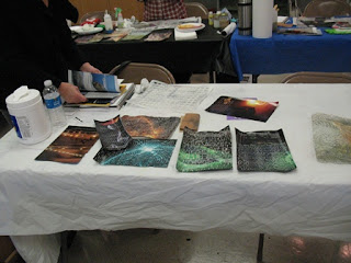
I've enlarged the images here on the blog so we could see them better. There was a coat of gloss acrylic medium applied before the next step.
- At this point after getting the background on the next step will be the Gesture Lines, using Stabilo pencils or Caran d'ache crayons. Which the Stabilos didn't wipe off after they were applied...hmm I did press pretty hard but the Caran d'ache crayons did.
- The Coat of gloss is the safety net here with making non objective and abstract art with the collage. As you can wipe it off if you don't like the mark you first make or the third mark.
- I've applied the collage papers and demonstrated the push back of the orange collage papers with white and then scribed into the area. Again you have a little time to wipe off the acrylic if you don't like it.
- I also smeared the acrylic around the collage paper from the book pages so you don't see the edge of the paper all the way.
- There is some collage paper at the top of three orange rings, that is just tacked down like the other papers with the iron.
- The next step is to apply the glazing and or the shadowing which will be applied next week.

In class I repeated the process of acrylics and plastic wrap with water. Mixing the colors under the plastic wrap.
- The process is different size amounts of you acrylic using white and a dark value along with the other colors. I suggest two or three at the most.
- Then spray you 140lb. watercolor paper with water, getting it really wet, "moist."
- Lay the plastic wrap down gently over the acrylic and water.
- Move the plastic wrap around and mix you acrylics underneath.
- Important part is you lift the plastic wrap and then create a print so to say and lay the plastic wrap in different places with the acrylic paint you have still left on the plastic wrap.
- This way you don't have to apply the acrylic before all over the place you will be doing that in the printing process with the plastic wrap and it makes a wonderful free flow effect.
- I then use the image transfer we explore last week on this one with the tree. And some of the paper I brought in for every one to use.
- The papers samples are already coated with gloss and so was the surface of the free flow background ready for collage etc.
- I know have two elements, the tree and the black circles with the dots. I've added in more to the story here besides the color.
- I've also skipped the process of gestural marks I use the brown stabilo and gave it more of my humanness to it.

Lighting isn't the best on this little guy but you can see from last week I create the white stencil effect and added on the torn magazine page with the word star. Instead of just placing it on there all in one word I did something different and tore the letters up and arranged them in a layered affect.
- I brought the stencil in a different place with more visibility of the dark over the lighter area. Something to always remember when working with the value in this approach.
- After the stamping of the stencil I went and didn't it over the faded white stencil.
- Faintly you can see the white gestural line of the crayons in this one.
- I've also block off an area with the deli sheets and rolled on white acrylic and scribe into the wet acrylics just as contrast and something different there to do.
- The collage papers that we are using have stained tissue paper so they lay over nice with the grid papers. Allowing some to peek through not altered by the stained tissue papers.
- Size of shapes you you use is important, something I try to remember because I have a habit of tearing the same size all the time. Changing ups sizes of shapes and shapes themselves to add greater interest to your work.

One thing that I've worked with for the past years is the Elements and Principles of design. It started mostly with the after the fact deal of looking at the work and seeing what's missing or not working.
By practice we start to understand how to create works that really connect and present themself well.
Not all piece of artwork will have every element and principle in it, nor should it but the ideas is to understand their use for what you need to create a nice composition.

With out a really line drawn there is a sense of a horizontal line, with area of different shapes and sizes of paper. All the way to the cut shapes of the magazine paper with the font on it in the middle section.
Do you see that?

At the point of intersections there where the small cut magazine papers are I had nothing and it was calling for something so at this point I have many choices,
- a stencil moment
- a stamping of a shape
- more collage papers
- or gestural lines.
- splatter of acrylic paints.
I didn't do all of them but I dis make more gestural lines and applied the cut of magazine font, ironed them on and then I splatter red acrylic. The little bits of red are part of the principles the repeating of color in different ways to help move you around the artwork. You can use mainly elements to do that but the repeating/repetition is part of the Principles of design.
As you see closer too the way the colors of red, brown, India yellow and white have mixed in the background and offered me more choice of color to work with. I wasn't a purple fan and really not a pink fan but when you bring these colors together in a mixing of minds...I do like them in a more natural flow.
Video Free Flow Collage,


Comments
Post a Comment
Thank you for support, interest and viewing my inner life with my outer life on this Blog. Wishing you many creative blessings and peace to you and yours,
~v~Laura